Creating a guilt-free ice cream brand for those who love midnight snacks
Melto is a modern ice cream brand that makes healthy feel effortless. Built around the idea that better-for-you treats shouldn’t feel like a compromise, Melto combines clean ingredients with bold flavor and visual attitude. It speaks to a generation that cares about what they eat — but isn’t about to give up dessert.
The brand voice is confident, understated, and a little clever. It doesn’t over-explain or over-sell — instead, it lets the product (and personality) speak for itself. Visually, Melto breaks away from the “clean wellness” look by embracing bold colors, flash photography, and a playful edge. The result is a fresh take on health — fun, craveable, and completely guilt-free.
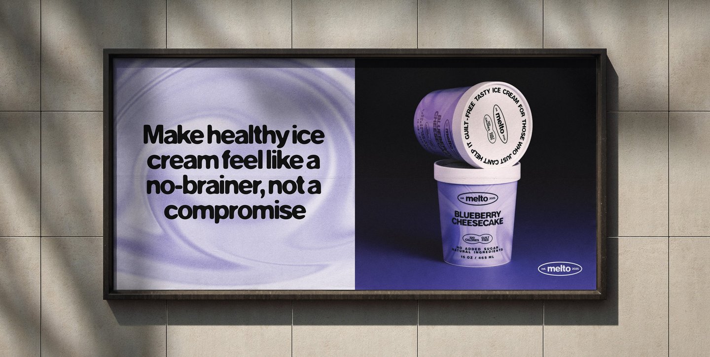
Make healthy ice cream feel like a no-brainer, not a compromise

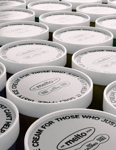
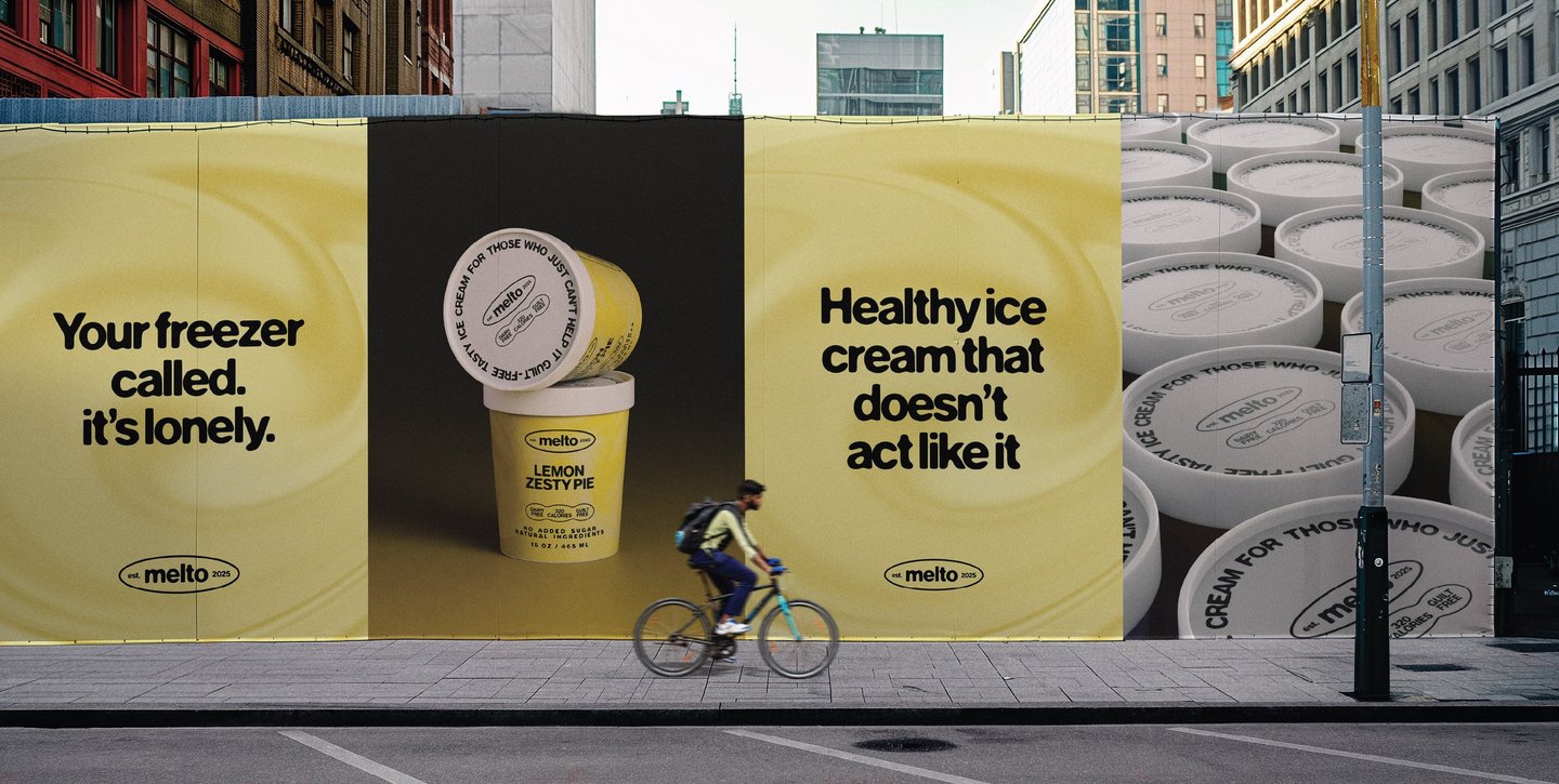
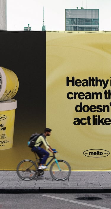
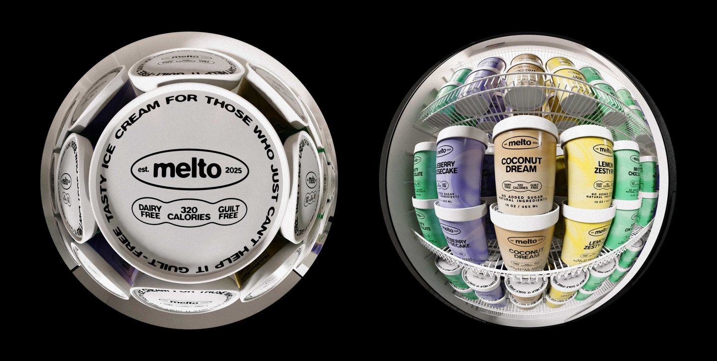
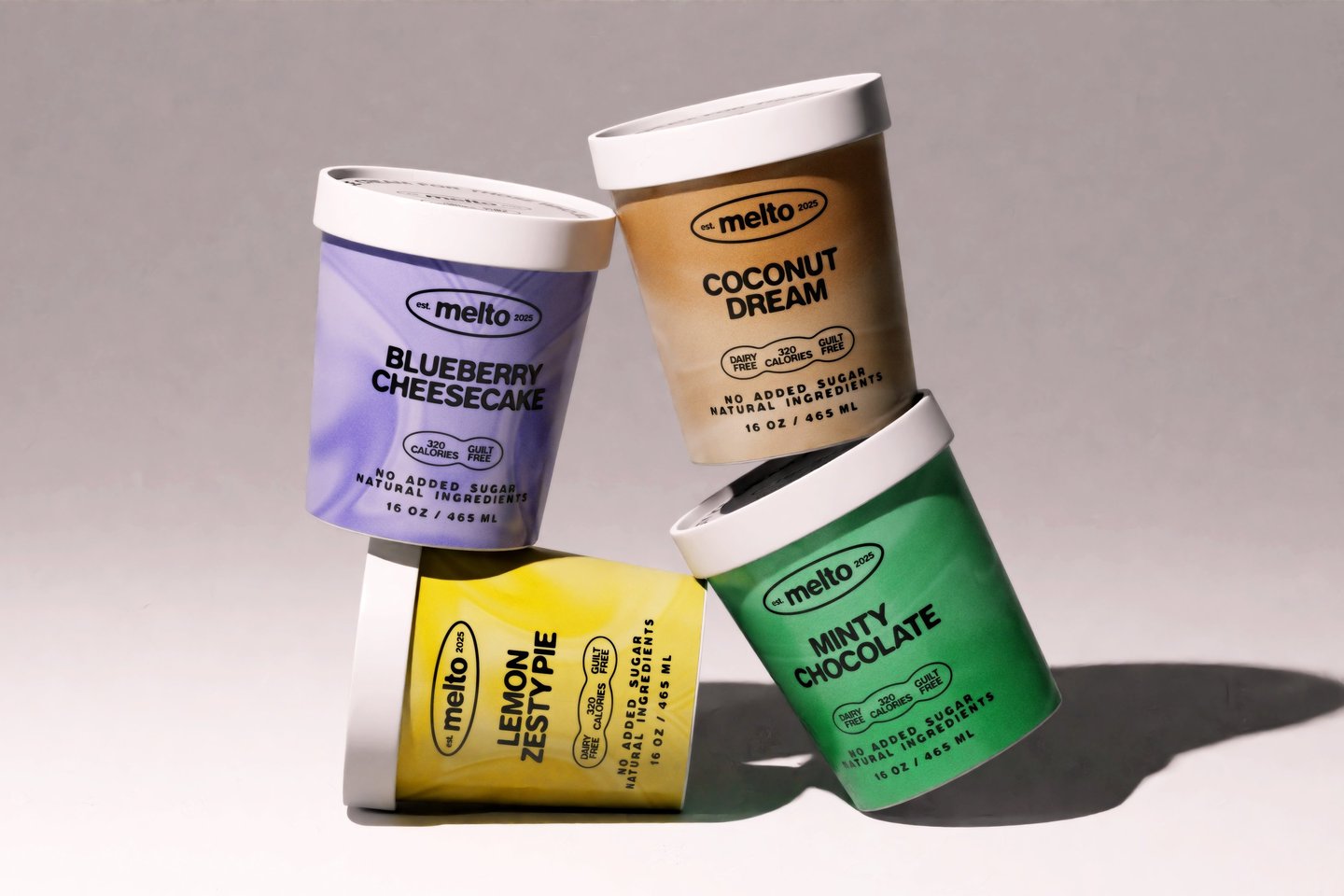
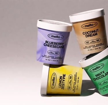
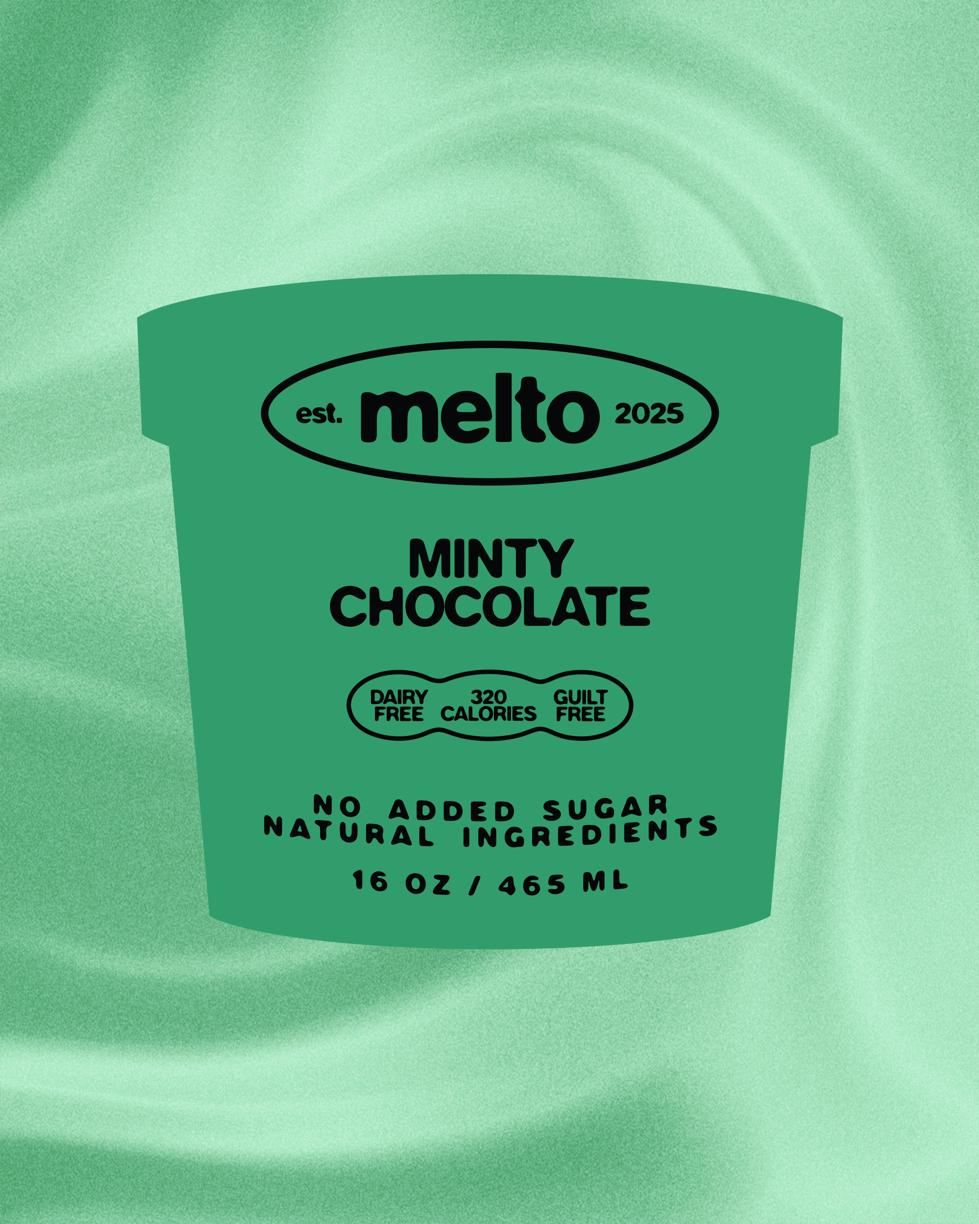
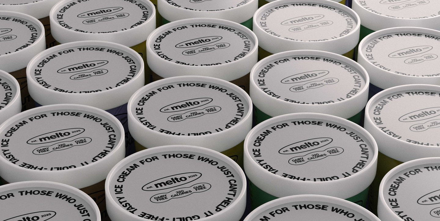
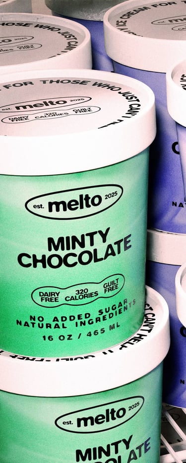
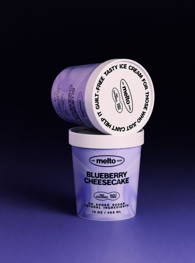
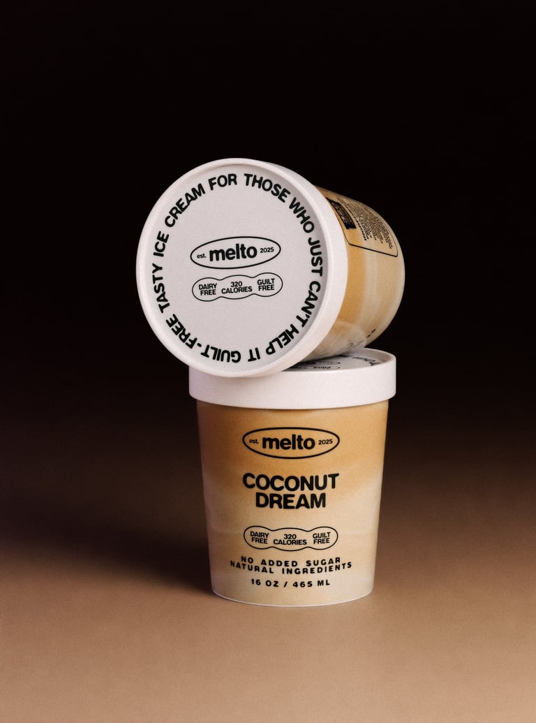
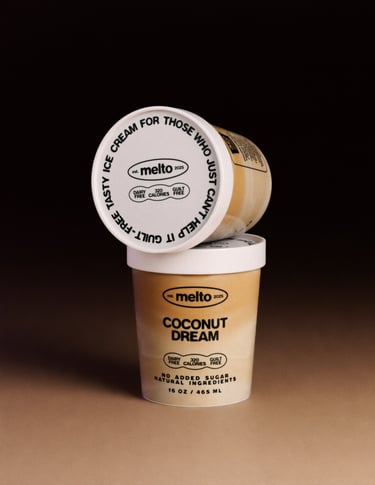
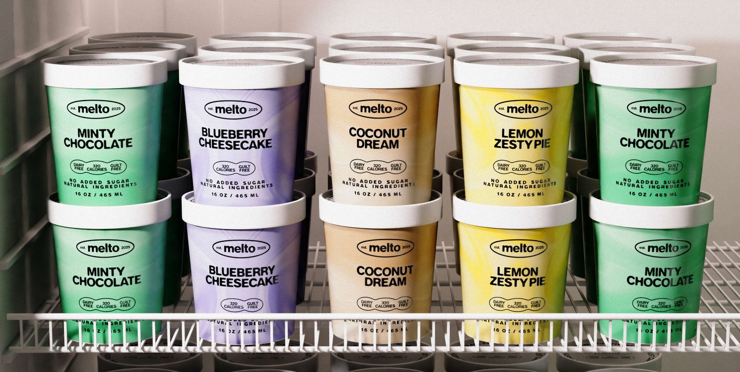
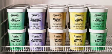
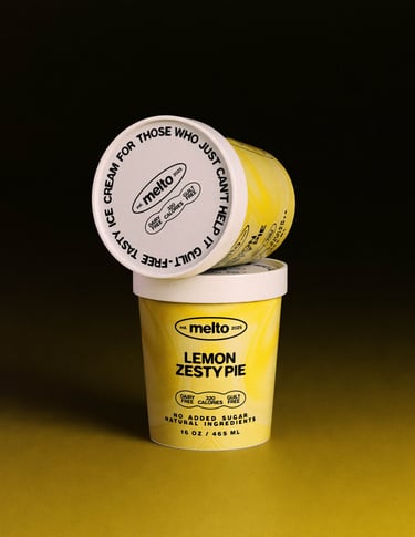
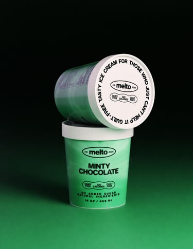
Melto’s look is all about flavor you can see. Each of the four core flavors has its own custom gradient swirl — smooth, punchy, and a little hypnotic, like a digital version of that first scoop. The swirls bring movement and energy, hinting at the creamy, melty texture of real ice cream.
The type is soft and rounded, like it’s just starting to melt. It keeps the vibe fun and friendly, while still feeling fresh and modern. Altogether, the visuals are bold, playful, and made to pop off the shelf — no sad beige health branding here.
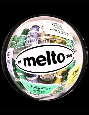
Visual Identity
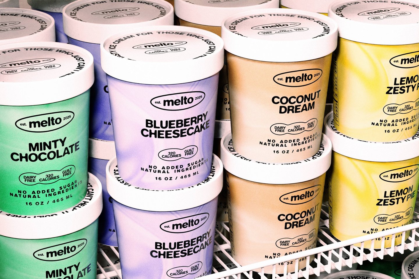
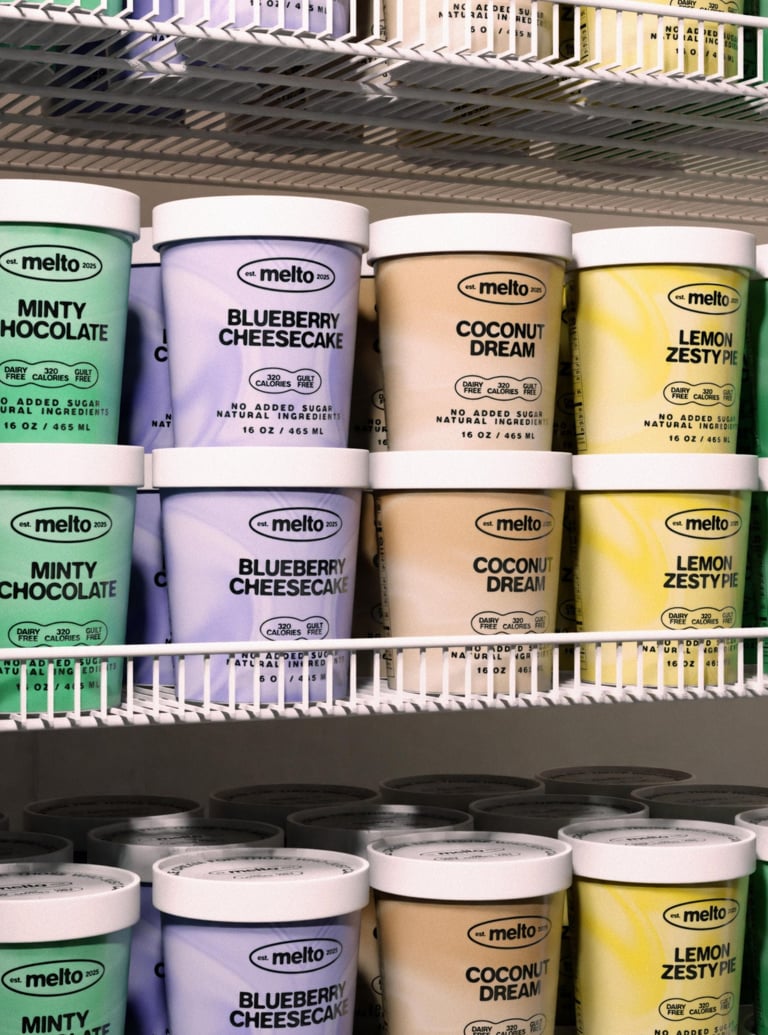
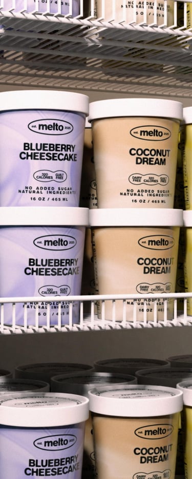
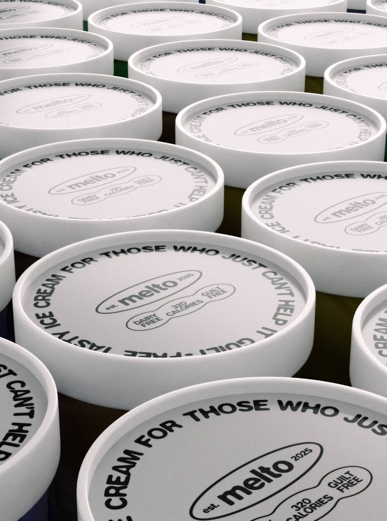
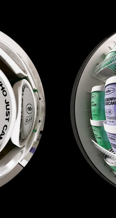
The products


ART DIRECTION, BRAND IDENTITY, 3D MODELING